Teckuniq brand guidelines
Everything in the identity is derived from the mark: its blue-to-sky gradient, its hard geometric cuts and the deep navy field it sits on. These rules keep it consistent everywhere.
The mark and the lockup
The monogram is a precision-cut T/K built from a single 135° gradient. The lockup pairs it with the lowercase wordmark.
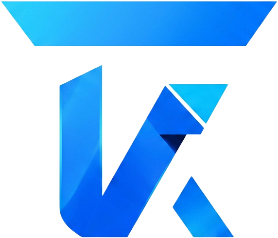 Primary markteckuniqHorizontal lockupLight surface
Give the mark room
Clear space is measured in X — the height of the mark's top bar. Nothing but background may enter this zone.
Dashed edge = 1X minimum clear space
1X clear space on every side of the mark and the full lockup.
2X clear space when the logo sits next to another brand's logo.
Header lockup height: 36px desktop, 32px mobile.
Minimum legible sizes: 24px mark on screen, 8mm in print.
Five colours, no exceptions
Every colour in the platform is sampled from the logo. No colour outside this palette may be introduced.
Abyss Navy
#0A1128
--brand-abyss
Primary background. Everything sits on this depth.
Deep Navy
#121C3A
--brand-deep
Surfaces, cards, elevated panels and glass layers.
Signal Blue
#2563EB
--brand-blue
Primary actions, the mark's core, emphasis.
Circuit Sky
#38BDF8
--brand-sky
Accents, highlights, gradient terminus, focus rings.
Ice
#E6F0FF
--brand-ice
Body and heading text on dark surfaces.
Three gradients, fixed angles
Gradients carry the identity's technological feel. Angles and stops are fixed — never improvise a new one.
Signal
--gradient-signal
linear-gradient(135deg, Signal Blue 0%, Circuit Sky 100%)
Primary buttons, the logo mark, key emphasis. Always 135°, never reversed.
Depth
--gradient-depth
linear-gradient(180deg, Deep Navy 0%, Abyss Navy 100%)
Section transitions and large background fields.
Text
--gradient-text
linear-gradient(100deg, Ice 12%, Circuit Sky 96%)
Single headline accents only — never body copy.
Geometric display, humanist body
The wordmark's low-contrast geometry sets the type direction: Sora for display, Manrope for reading, mono for codes.
Display — Sora
Headings and the wordmark. Semibold, tight tracking, generous line height.
Precision by default
Body — Manrope
All running copy, navigation and UI labels. Regular to medium weight.
Premium digital experiences, built to convert and built to last.
Mono — JetBrains Mono
Codes, reference numbers and technical metadata only.
TKQ-4821-90AF
Do and don't
Do
- Keep the mark on Abyss or Deep Navy, or on pure white when print requires it.
- Maintain clear space equal to the height of the mark's top bar on all four sides.
- Use the full lockup (mark + wordmark) at first appearance on any surface.
- Scale the mark proportionally; minimum size is 24px on screen, 8mm in print.
Don't
- Do not recolour, flatten or invert the gradient inside the mark.
- Do not place the mark on busy imagery or mid-tone blue backgrounds.
- Do not stretch, rotate, skew or outline the mark.
- Do not add shadows, glows or strokes to the wordmark.